Shaky Foundation
Susan De Vos | March 16, 2023


Two shaky methodological fundamentals upon which Metro's network redesign plan and its equity analysis are based are: 1) how proximity is conceived and measured; and 2) how the low income population is conceived and measured when determining equity. Shaky foundations lead to shaky conclusions. How shaky? Sensitivity analyses, often performed by a third party, could provide reasonable estimates. Proximity as Distance and Travel Time
Not simple at all! Let us first consider distance. Distance For transit, freeways are barriers, not corridors. ... people [are required] to walk in unsafe and unpleasant conditions to access transit service. This will naturally suppress transit ridership at those bus stops below what it could otherwise be. (p. 13)
Freeways are not the only barriers to bus stops in Madison of course. Not only is there a lack of sidewalks in some places, but also slippery inclines, uncleared sidewalks, lack of ramps for wheeled vehicles, darkness, snow drifts, having to cross a busy street, icy conditions and so forth. It is not reasonable to treat all ¼ miles equally when considering access. If application of a simple ¼ mile rule is wrong, how valid then are comparisons of such social groups as "people of color," ""senior residents," "residents under 18" etc. using that metric (e.g. on pages 41-44 of the Alternatives report). What might it really mean for a bus stop to be moved a few blocks away if it is moved from a front door to only two or three blocks away but across a busy street and to a place without lighting? Nor is it just the complexity of considering terrain in addition to inches on a map. It is also a matter of what data can be used to apply the ¼ mile rule. The Equity Analysis used data for census block groups to assess distance, not the more finely-grained single census blocks. As explained on page 12 of the Analysis: "Any bus trip that has a bus stop within ¼ mile of the Census block group is considered to serve that block group." Census block groups are often large, a square mile not being uncommon. To then only require the nearest point of that block to be within a ¼ mile of a bus stop means that someone fully 1¼ miles away could still be considered close to a bus stop. Is that valid? To be fair, the analysis on income (more on that later) had to use 2020 American Community Survey data that could only specify matters down to the census block group level but other common population characteristics (including race/ethnicity) are available down to the more finely-grained level of single census blocks. If those more discerning data were used, would the results of the analysis be significantly different? Maybe. That is something that could be rather easily determined by a sensitivity analysis Time The Redesign study used isochrone maps to indicate " ... where you could get to, on average, in 45 minutes door-to-door (including walking, waiting and riding), from a given starting point at noon on a weekday" (p. 47 of the Alternatives report). The way "wait time" was estimated was problematic however, could skew matters significantly and should be redone. A reason is that "wait time" was assumed to be half a bus's frequency (footnote #2 on p.47 of the Alternatives report). Thus for an hourly bus, "wait time" was estimated to be 30 minutes, for a 15 minute bus 7½ minutes. That might make sense if buses did not run on schedule or people did not check schedules. But Madison buses do run on schedule and current transit riders do use schedules. Indeed, the first item someone sees on Metro's website is a Trip Planner linked to its schedule. If buses did not run on schedule, what reason would there be to display the Trip Planner so prominently? If an average wait time of 30 minutes is a reasonable assumption, why does the Metro's Ride Guide (available on its website) tell people to Be at your stop 5 minutes before the scheduled time (page 4 or 5 of the file without page numbers)? Given that the current and redesigned travel times are compared using a metric that has been constructed questionably, how are we to evaluate comparisons using that metric? A reasonable approach would again be to conduct a sensitivity analysis that could address questions about the significance of different forms of measurement. Otherwise, the speculation that the metric was designed to maximize the favorability of the redesign over the current system cannot reasonably be dismissed. Low Income PopulationOne of Madison's under-represented groups supposed to benefit from the network redesign is its low income population. It is thus very important to identify this population correctly when evaluating whether it in fact does benefit from the redesign. The Equity Analysis does not do that however. Early on, the Redesign Study acknowledged the existence of two very different low-income populations located in different areas of the city. Its Choices report of February 2021 noted two very different areas of "concentrated poverty" (p. 33): 1) in central Madison likely related to the UW student population and a temporary poverty; and 2) in outlying areas, more persistent and associated with concentrations of Black, Latino and some Asian peoples. Past transportation planning has generally taken this into account and excluded students from its analysis of low-income populations of interest. Metro's own previous Equity Analysis did so: MPO staff have excluded university students from their household income charts and have cautioned Metro staff in using this data for its fare analysis. The MPO found that asking students to provide household income numbers is challenging for many reasons. For the consistency of data, students would need to report income of roommates as household income. Many students might not know this number or be willing to share. Other students may have included their parents' income or reported their income as low, but are actually financially supported by relatives. (p. 51 of Metro Transit Title VI Program 2017 – 2019 REPORT retrieved from https://www.cityofmadison.com/metro/documents/Metro_Title%20VI_2017-2019.pdf on Feb. 27, 2023)
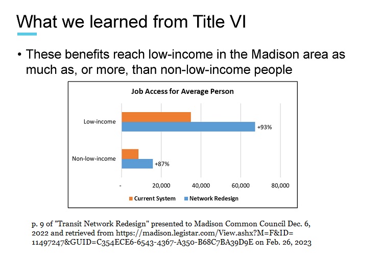
But the redesign's Equity Analysis of October 2022 ended up self-consciously combining the two populations. Why – because the BRT line better serves student areas in central Madison than outlying areas where there is a different kind of concentrated poverty? In fact, the NAACP observed in an open letter to the Transportation Commission dated Nov. 9, 2022: ... This is the most problematic statement in the article. It suggests that low-income residents city-wide will receive more service. It asks that this finding be better explained. In general, sensitivity analyses, often performed by a third party, could provide much more reasonable and informative estimates than what currently exist. Madison deserves no less. |